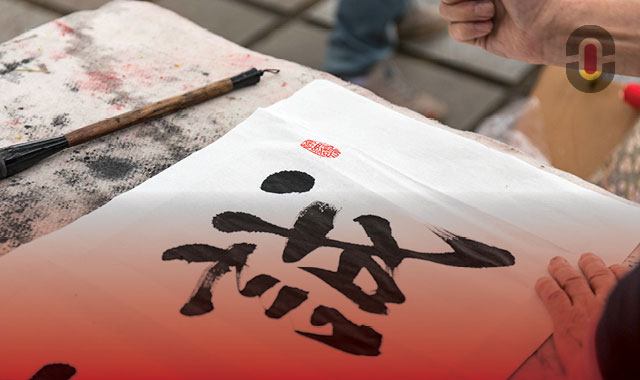
When it comes to Chinese language, we don’t need to quote numbers and statistics to convince someone that it’s one of the most widely used languages in the world. Everyone knows that. It’s a beautiful and fascinating language, and it looks so different than most western languages that we’re used to.
How many kinds of Chinese are there?
As we know, Chinese can be written with two different sets of characters — Traditional and Simplified. Both have character shapes that are roughly square, and each character has a monospaced square width, which forms clean grids no matter the direction the text is typed in.
Simplified Chinese is mostly used in Mainland China, and it’s been the official writing system there since 1954, while Traditional Chinese was used prior to 1954. Traditional Chinese is still used widely in Chinatowns outside of China, as well as in Hong-Kong, Taiwan and Macau, where it’s the official written language. In Mainland China, it’s used only in extremely formal cases. You can also find Traditional Chinese in other languages that have developed with influence from ancient Chinese.
Writing Chinese language
Historically, Chinese was set vertically and was being read from top to bottom and from right to left. However, in the 50s — alongside the introduction of Simplified Chinese — it became standard to write in the Western style, from left to right and from top to bottom.
Nowadays, Chinese text is mostly read from left to right, the same as English. Because of the square monospaced nature of the characters, it works equally well both horizontally and vertically. This means that in artistic contexts, where blocks of texts are relatively short (like book covers, logos and signage), it’s ok to get creative when it comes to how you layout characters without losing too much readability.
Another significant characteristic of Chinese typography is the enormous variety of characters that are available. Without any exaggeration, there are literally thousands of them! The smallest standard Chinese font contains 6763 characters. A typical Chinese font file is usually at least 5MB in size and some of them can be over 20MB, which is problematic if you need it loaded on a website. That’s the reason it takes so much time and effort to create a Chinese font, and it’s also why Chinese fonts rarely have a variety of weights — unlike their European counterparts, which often have as many as five different weights.
Chinese fonts
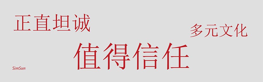
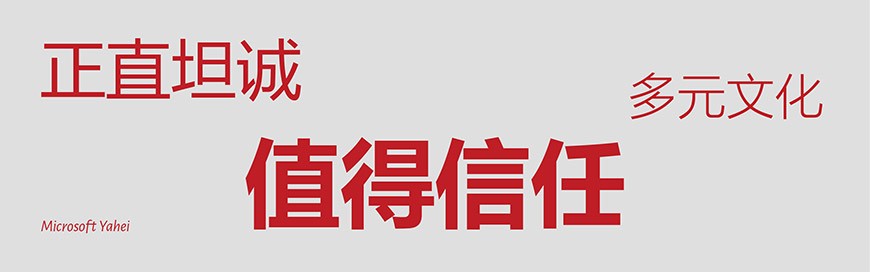
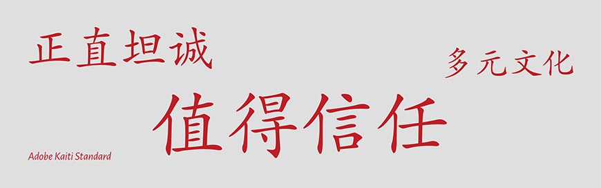
The two basic groups of Chinese fonts are songti (宋体), which you could think about as the Chinese serif, and heiti (黑体) — the Chinese version of sans serif, respectively. Additionally, there are decorative brush script fonts called kaiti (楷体).
Songti (宋体)
If one type of font had to be chosen to represent Chinese typography, it would be the songti type. Early songti scripts were in use as far back as the Song Dynasty (960-1279 A.D.), when Chinese woodblock printing was in its golden age.
Due to the grain of the wood in the woodblocks, which ran horizontally, horizontal lines were easy to produce and could be made thinner. Vertical lines, which ran counter to the wood grain, were prone to breakage during carving, and thus had to be made thicker. In addition, because the end points of the horizontal lines were easily worn away, flourishes were added to make them thicker, so they’d last longer. This is how songti — the Chinese serif characterized by perfectly straight horizontal strokes, wider verticals, and classy but regimented flourishes — was born.
The font Zhongyi Songti (中易宋体), or commonly known in English as SimSun, and its predecessor, New Songti (NSimsun – 新宋体) is the Times New Roman of Simplified Chinese, made popular due to its out-of-the-box inclusion in Windows XP. The Simsun love affair continued until very recently: it was still the default Simplified Chinese input font in Windows 7 systems. Ask a Chinese web designer what makes an interface look “Chinese”, and you’ll often get a chuckle alongside the answer “Simsun, 12pt” — that should give you an idea of how widely this font was used.
Examples for Songti fonts: SimSun, FZCuSong, NSimsun;
Heiti (黑体)
The other major classification is the heiti, similar to “sans-serif”. Heiti fonts are a relatively modern invention although they were seen emerging in commercial press around the early 1900’s.
SimHei was the standard sans-serif to SimSun’s serif. Recently, Microsoft Yahei has started to replace SimHei as the preferred standard in web layouts, but there are still a couple of compatibility issues: MS YaHei was introduced in Windows Vista, but the number of machines still running Windows XP in China — even in 2020 — would blow your mind. So while everyone’s pretty tired of looking at SimHei, we haven’t quite reached the point where people are willing to give it up completely just yet.
Yuanti (圆体) is typically considered a subclass of Heiti (sans-serif). It’s more of a search tag than a font type — the Chinese word yuan means “round”, and that’s exactly what these are: sans-serif fonts with soft curves at the corners. Yuanti is popular in modern corporate collateral and advertising materials. There are no web-standard fonts here either.
Examples for Heiti fonts: SimHei, Microsoft Yahei, Source Han Sans/Noto Sans, Yuehei, Shanghei;
Kaiti (楷体)
A kaiti font takes the shape of basic brush script lettering — or so called “regular brush”. A Kaiti font is still not a novelty font because it never gets overly flowery, yet it is constructed within certain parameters while maintaining an upright structure.
Examples for Keiti fonts: Kaiti (or Biao Kaiti), FZKai, Adobe Kaiti Standard
Which fonts should you use?
We compiled a couple of convenient lists of fonts to choose from, according to your particular needs.
The most popular Chinese web-safe fonts:
-
- Heiti fonts:
- Hiragino Sans GB (冬青黑体简体中文)
- Microsoft Yahei (微软雅黑)
- Simhei (黑体)
- Songti fonts:
- Simsun (宋体)
(most screens are still non-Retina, so it’s much safer for designers to use Heiti fonts)
- Simsun (宋体)
- Heiti fonts:
Chinese fonts for free commercial use:
- 方正黑体 FZHei-B01S
- 方正书宋 FZShuSong-Z01S
- 方正仿宋 FZFangSong-Z02S
- 方正楷体 FZKai-Z03S
If you need a universal multi-purpose font (especially for multi-language tasks):
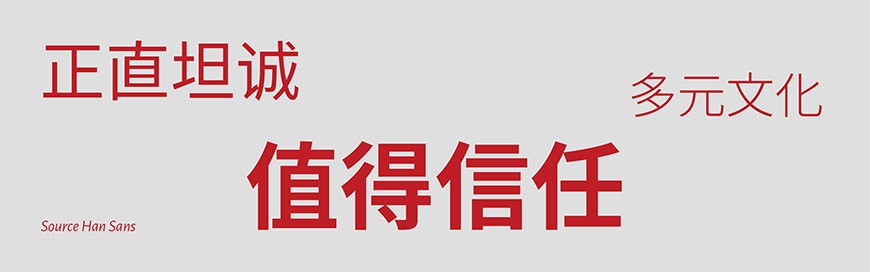
Source Han Sans
It’s a sans-serif gothic typeface family, created by Adobe and Google. It was also released by Google (under the Noto fonts project) as Noto Sans CJK. What makes this font so special is the fact that Source Hans Sans has 65,535 characters and 7 different weights (ExtraLight, Light, Normal, Regular, Medium, Bold, and Heavy), and it provides a consistent and systematic style for Simplified Chinese, Traditional Chinese, Japanese and Korean. Things get even better— it’s open-source!
A curious fact about this font: Despite having a “Regular” weight, it also has a “Normal” weight. The reason for that is the optical illusion that makes the font look bolder when used on a dark background. So, the Regular is for light backgrounds and the Normal is for dark ones. Neat, eh?
Mixing Chinese and Western texts
Designers sometimes face the challenge of working with a mix of languages. That is especially common in places such as Hong Kong, where both Chinese and English are considered official languages.
It’s strongly recommended to add a space between Chinese and English, because English naturally has a space between words, while Chinese does not. Chinese also has larger spaces between each characters, compared to English letters. Ideally, there should be treated kerning between Chinese characters and English letters. Luckily, both Adobe InDesign and Microsoft Word offer options on how to do that.
The current trend
As we mentioned earlier, it takes a lot of effort to create a Chinese font. Fortunately, a lot of big Chinese brands — such as Alibaba, Xiaomi, Tencent, Vivo, and Oppo — are developing their own fonts for marketing purposes. Hopefully, that will lead to a greater variety of Chinese fonts in the future.