
Most of us living in the West are used to the concept of 1 country=1 language=1 alphabet. But when it comes to Chinese things are a bit more complicated. Okay, maybe *quite* complicated is the right way to describe it but we do not intend to explain that in the current article. Our aim is to actually make things simple, clear, and useful for you.
The purpose of this article
This article comes as a continuation of our previous insight on Chinese fonts we published a while ago. We wanted to summarize the basic information about the Chinese scripts but with a little twist. We know that the choice of fonts matters a lot when presenting information to a certain audience. With Chinese this is even more so due to the fact that there are two written forms of the language. So if you are creating content, which is going to be presented to a Chinese audience and you have never done that before, you will certainly end up in a situation where you don’t have a clue which font to use. Why? Let’s say you can trust us on this…
Hopefully, with the current article we’ll be able to help, not only graphic designers and publishers out there but other professionals, too. We’d like to get you started working with Chinese. At the end of this article, you’ll find a list of the best Chinese fonts you can use as a starting point on your journey when you have to work with texts in Chinese.
Written language & spoken language
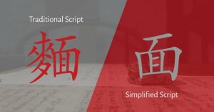
- Written language – there are two written forms (scripts) of Chinese – Traditional and Simplified. Historically, the Simplified version was created in the 50s and was based on the Traditional one. Its purpose was to make reading and writing easier and more accessible to the general population. You’d think “Great, so they made Chinese easier for everyone!” but not so fast…There are many geographical and political factors at play and because of this now both traditional and simplified scripts are used according to geographical location or ethnicity. As a result nowadays both Traditional and Simplified scripts are used according to geographical location or ethnicity. So let’s recap: The Chinese language can be written in Traditional or Simplified script depending on the location or ethnicity of the target audience.
- Spoken language – and that’s where we get to the tricky part. The thing is there isn’t a single Chinese language. Instead, there are different dialects under the umbrella of Chinese and you won’t be wrong to call them languages, as some of which are mutually unintelligible. In most cases when someone mentions “Chinese”, that would refer to Mandarin but there are also Cantonese, Hokkien, and Hakka. Let’s take Cantonese as an example. Do we write it in Simplified or Traditional script? The right answer, however, is not straightforward. The truth is it depends! Cantonese is spoken in Hong Kong, Guangdong province in China, Macau, Malaysia, Singapore, as well as in Cantonese communities in other countries. So we should take into consideration both the proper written and spoken forms of our target audience in order to be able to reach them and not come off as obnoxious westerners.
All that can be quite overwhelming so here’s a table to help you get an overview of the most common cases:
| Location | Spoken | Written |
| Mainland China | Mandarin (official), many other dialects | Simplified |
| Taiwan | Mandarin (official), Minnan, Hakka | Traditional |
| Hong Kong & Macau | Cantonese (official), Mandarin | Traditional (+Cantonese*) |
| Malaysia | Mandarin, Minnan, Cantonese, Hakka, etc. | Simplified (new-school), Traditional (old) |
| Singapore | Mandarin (official), Minnan, Cantonese, Hakka, etc. | Simplified (new-official), Traditional (old) |
| USA / SE Asia | Mixed | Traditional / mixed |
* Usually all texts are written in Mandarin and smaller dialects shouldn’t be written for any formal communication.
However, in Hong Kong and Macao, it’s possible to write Cantonese (with traditional characters). Beware, though, that people who don’t speak Cantonese wouldn’t be able to read and understand the text because the two languages are very different in terms of grammar, word order, and so on. If your client asks for Chinese translations for Hong Kong, make sure to double-check if they want Mandarin Chinese or Cantonese.
Thаt cheat sheet is courtesy to our linguist Tina and you can download a copy to keep at hand at all times along with a detailed article we’ve already published on the topic, which you can read: What is the difference between Simplified and Traditional Chinese?.
Scripts & Fonts
 If you want to learn more about Chinese fonts design-wise read our previous article which focuses on the different styles, tips on when to use what, and gives some font suggestions.
In this article we’ll be answering another important question: do all Chinese fonts cover both the Simplified and Traditional scripts? In a perfect world…
The reality, of course, is a bit more complicated. Some fonts do cover both scripts, some contain glyphs for only one of the two scripts. We know this can be quite headache-inducing so here we’ll list the more popular fonts separated into these three categories.
- 1. Fonts for Simplified Chinese (SC) script:
- Hiragino (the typeface family contains also Japanese characters, so it would be a good choice for Chinese texts with Japanese words in them or vice versa)
- Microsoft YaHei (featured in Microsoft’s user interface, it is optimized for screen use)
- SimHei
- SimSun
- 2. Fonts for Traditional Chinese (TC) script:
- Microsoft JhengHei
- MingLiU (Taiwan) and MingLiU_HKSCS (for Hong Kong respectively)
- I.Ming
- 3. The magical land where you get all the glyphs for both scripts (also known as Pan CJK, meaning they contain all the glyphs for Chinese, Japanese, and Korean):
- Source Han Sans / Noto Sans CJK – created by Adobe & Google
- Source Han Serif / Noto Serif CJK – Noto’s serif variant
- Arial Unicode MS – the extended version of the well-known Arial
Why is all that so important?
We crunch up so much text on a daily basis that we hardly think about its layout or how it looks. But when we are preparing a text for an audience on the other side of the globe we should consider what they are used to and what feels natural to them. Otherwise it’s very easy to look untrustworthy or disrespectful of the people you are trying to attract. The effect is similar to your own reaction if someone presents you with an English text that has no spaces or is written in Cyrillic? You’ll have a tough time reading it if bothering at all, right? So if you want your message to reach the people it is intended for – keep in mind it should be tailored for them.
In conclusion: that one is like domestic work – if done properly it won’t be noticed at all. But if it is not – it will leave a very bad impression on your guests. Our goal after all is to be the perfect host, right?