Japanese language is a fascinating topic, and inspired by our Japanese week we decided to keep things going and provide you with some practical information regarding it. One of the most important factors when preparing marketing materials or any written document in another language is the way you choose to display text.
Asian languages are very specific in this regard, and can actually be quite difficult to handle. Due to the difference in the writing system and the space distribution of the language itself, we often perform desktop publishing after translation so we can adjust the way the information is displayed in the target language.
We’ve chosen to share some practical advice based on our previous experience working with Japanese fonts.
Japanese language & Fonts
Let’s start with the basics and see which options are suitable for serif and sans serif fonts in Japanese.
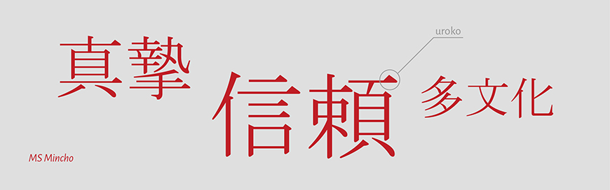
Our first choice is Mincho, and we recommend it when you need to use a serif font. “Min” in “Mincho” stands for “Ming”, and the “Cho” particle stands for dynasty. It’s based on an ancient writing method, which is why the style of this font can be considered historic.
When you look at the “Mincho” font, it’s comprised of contrasting vertical and horizontal strokes. Mincho typefaces often are recognizable by the small triangle nestled into the stroke. Most of the times it can be found on the top or top-right edge of the stroke and it adds a bit of a more traditional touch to the way the text is written. The triangle itself is called “uroko”. It represents the exact moment of “pause” after performing the brush stroke, when the writer prepares to continue the stroke or has completed it.
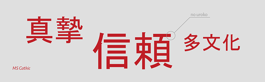
When it comes to Japanese fonts, Gothic is our recommendation for when you need to use a sans serif font. These typefaces, similar to western sans-serif fonts, often have consistent stroke-weights – as well as more simplistic strokes. You can’t spot an “uroko” on these guys. Gothic is often used in digital marketing materials, other online content and if a modern look is what you want to embody, this is a typeface that will allow you to do so.
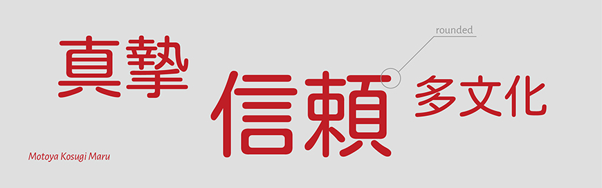
There are Japanese fonts that come with various font styles, some of which are very easily distinguishable from one another. Maru and Kaku font styles, in particular, appear to be polar opposites, at least when compared directly. If you’re looking for a font style to complement a typical Gothic font or other sans serif fonts, you should use ones with the Maru font style. The name of the font style itself means circle (or round), and as you might be able to guess, this is because most “maru” typefaces have rounded corners.
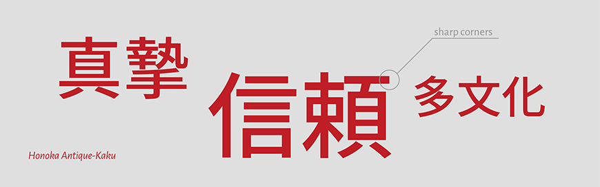
Kaku, on the other hand, literally means “corner”. Fonts using the Kaku style represent a distinctly different style: sharp, with pointed corners, and are thus a good choice to use when you’re aiming for a simpler, non-serif look.
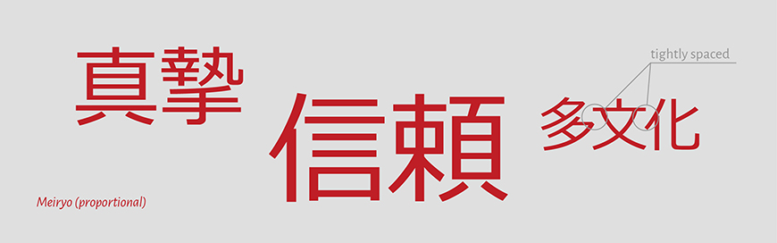
“P” stands for Proportion
You’ve probably seen the letter “P” next to a font while you were searching for one that matches your requirements. In this case, you’ve stumbled upon a font where each character has been condensed independently, which results in tighter letter-spacing. If you are still wondering why this is important – the big advantage is that the characters take less space but remain readable.
Do not use italics with Japanese text!
Unlike European fonts – where italics developed from cursive hand-written script – in Japanese the very structure and creation of the language by hand doesn’t support the use of an angle when writing in cursive at all. In Japanese, writing incursive does not lead to the characters being displayed in an angled fashion.
You can replace the Italics by using font-weight variations (e.g. light or bold), brackets, or writing the word in katakana (if appropriate) to emphasize the text. For titles of books, publications, media, etc.; use the Japanese double quotation marks. For introducing terms, use the Japanese single quotation marks. In other instances where italics are used in English, it’s usually safe to use the Japanese single quotation marks.
About Font Size
The full-cap height and square profile of Japanese characters make them appear larger, so you may reduce the font size by 10 to 15%. You may reduce them by a smaller percentage for body text and a higher percentage for headings.
For the same reason, the leading should be increased by 10 to 15%, so the lines of text don’t appear too tightly stacked together and have some breathing room between them.
In conclusion, when we talk about designing text – it’s a highly preferential thing. Asian languages, however, generally have their limitations and requirements.
Japanese audiences are highly sensible to the way information is displayed, and choosing the proper fonts will definitely help you with reaching and impressing such an audience. That choice of a suitable Japanese font is like everything else that relates to Japan – you should know the culture and the differences between the markets in order to be successful.