
With the increasing global popularity of Japanese media—from movies and music to video games and anime—more people are becoming engaged with the Japanese language. Naturally, the field of translation and print production for Japanese has grown alongside this cultural wave.
One critical aspect of this field is desktop publishing (DTP), which ensures that printed Japanese materials are not only readable but also visually appealing. In this article, we’ll explore key principles to keep in mind while working on Japanese DTP, starting with an understanding of the language’s unique structure and characteristics.
A Brief History of Written Japanese
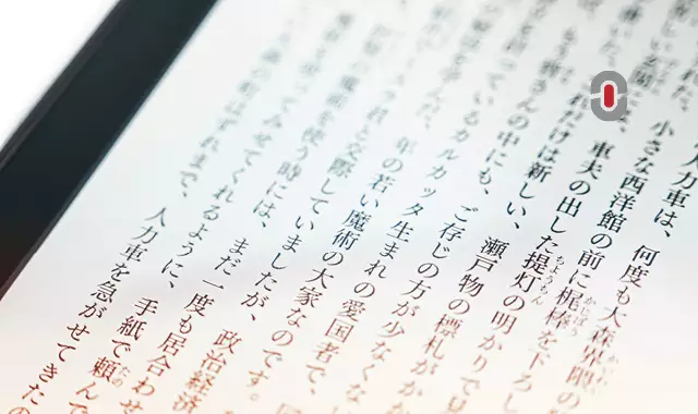
The Japanese language has three main writing systems: hiragana, katakana, and kanji. These systems can be combined within sentences, allowing for a flexible and rich written expression. Another fascinating aspect of Japanese is its dual writing direction: it can be written horizontally (left to right) in Western-style formatting, or vertically (right to left), a more traditional approach often used in books, newspapers, and other print materials.
Historically, hiragana was primarily used by women, while men preferred kanji and katakana. By the 10th century, however, hiragana became widely adopted across the population. It consists of 48 syllables and is commonly used at the end of words in Japanese, a practice known as okurigana. Hiragana is also frequently seen in comic books, animation, children’s materials, and used alongside kanji to show pronunciation.
Katakana is mainly used to write foreign loanwords (e.g., ケーキ for “cake,” コーヒー for “coffee”), foreign names, and to emphasize words or phrases (often corresponding to the italicized text in Western languages). Katakana characters are sharper and have more angular lines compared to hiragana.
The third system, kanji, originates from Chinese characters, reflecting the historical lack of a native written Japanese script before the 5th century. Although many kanji characters share similar meanings and pronunciations with their Chinese counterparts, there are notable differences. Kanji can be categorized as pictographs (simple drawings of objects, e.g., 人 for “human”), ideographs (abstract concepts, e.g., 上 for “above”), or combinations of both.
One distinctive feature of Japanese sentence structure is the subject-object-verb (SOV) order, which sets it apart from languages like English. Additionally, Japanese nouns lack gender, grammatical number, and definite articles, and the language has only two tenses: past and non-past, with the latter covering both present and future actions.
Key Considerations for Japanese Desktop Publishing
Working with Japanese in desktop publishing can be complex due to the unique challenges posed by the writing systems, the inclusion of Arabic numerals and English terms, and the need for careful font selection. Here are some essential points to consider:
1. Font Selection
Choosing the right font for Japanese text is critical to ensuring readability and aesthetic appeal. Japanese fonts come in serif and sans-serif styles, just like English fonts. Popular fonts include:
- MS Mincho (a serif font created by Microsoft)
- MS Gothic (a widely-used sans-serif font)
- Kozuka Gothic Pro (an Adobe font with multiple styles)
- Noto Sans JP (a modern, versatile font designed by Google, supporting all Japanese writing systems)
When selecting fonts, pay attention to the client’s specifications, whether the font is serif or sans serif, and the appropriate weight (e.g., regular, bold). It’s important to ensure that the fonts support all three writing systems and can handle both Japanese and Latin characters.
2. Formatting Japanese DTP
Japanese DTP requires special attention to certain formatting rules that differ from Western languages:
Italics: Japanese texts rarely use italics, as italicized characters tend to become difficult to read. Instead, emphasis is often achieved by using bold text or adding quotation marks or brackets around the emphasized text. Book titles and other important sections may use Japanese-style quotation marks (『…』) or single quotation marks (「…」) for emphasis.
Bold: Using bold in Japanese is effective for emphasizing text, but it can be tricky because some fonts have multiple weights (e.g., regular, medium, bold). In design software like Adobe InDesign, bold text can be created by applying a stroke with the same color as the text, rather than relying on the standard bold function.
Font Size: Japanese text may appear longer than its English counterparts due to the different character sets. If text doesn’t fit within a predefined space, try reducing the font size by 0.5 to 1 point. Be sure to reduce leading (the space between lines) slightly as well, but avoid making lines too close together.
Word Division: Japanese does not use spaces between words, which can create challenges when fitting text into a layout. In Adobe InDesign, you can use the “No Break” feature to prevent unwanted word breaks. Additionally, make sure punctuation marks like full stops (。)commas (、), and brackets (」) do not appear at the beginning of a line, as this could disrupt the flow of the text. Read more on punctuation in Japanese DTPs here.
3. Handling Latin and Numeric Text
When dealing with text that includes Latin letters or numbers, it’s important to ensure consistency with the source font. While you can change the font for Japanese text, always keep the Latin characters and digits in their original font to maintain visual harmony.
4. Software and Tools
While software like Microsoft Word can be used for basic formatting, more advanced DTP work requires professional tools like Adobe InDesign or Illustrator. These programs offer powerful features for managing complex scripts, adjusting text flow, and ensuring that Japanese characters are properly displayed.
Key takeaways
Japanese desktop publishing is a unique and intricate process that requires a deep understanding of the language’s writing systems, formatting conventions, and design principles. By choosing the right fonts, understanding formatting nuances, and utilizing the best design software, you can ensure that your Japanese publications are not only accurate but also visually appealing. With these tips in hand, you’re well on your way to creating stunning, professionally designed Japanese text!
Need help managing your multilingual projects? Discover our tailored desktop publishing solutions designed to streamline your workflow and ensure high-quality results. Learn more about our services here.