Desktop publishing (DTP) is a process of using specialized software to create visual documents for print or digital media. DTP is an integral part of translation as it ensures that the translated texts are visually appealing and formatted to meet the target audience’s typographic and cultural standards. Using DTP will help maintain the integrity and readability of the content across different languages and markets as well.
DTP involves the integration of text, images, and graphic elements to produce professional publications such as brochures, magazines, books, newsletters, or ads. DTP has revolutionized the publishing industry by making it easier for individuals or small businesses to produce high-quality printed materials.
Desktop publishing in Korean, however, does have some intricacies that need more attention. DTP in Korean involves the handling of Hangul, the Korean writing system – which requires special font handling and text flow considerations. In this text, we are going to delve more into the practical issues and solutions regarding DTP in Korean.
The Importance of DTP in Korean
Desktop publishing (DTP) is an important tool when it comes to translation to Korean as it helps meet the unique linguistic and cultural demands of the Korean audience. The Korean writing system, Hangul, can be complex, so doing desktop publishing in Korean should be tailored specifically to Korean text processing to ensure clarity and readability. Desktop publishing of Korean texts should incorporate culturally relevant designs to further enhance the visual appeal and effectiveness of the publications. This is crucial in industries such as advertising, publishing, and marketing, where aesthetically pleasing messages are one of the keys to reaching your target audience. Thus making sure to be mindful about the specifics of DTP in Korean is vital for producing content that resonates with the Korean public.
Understanding the Korean writing system
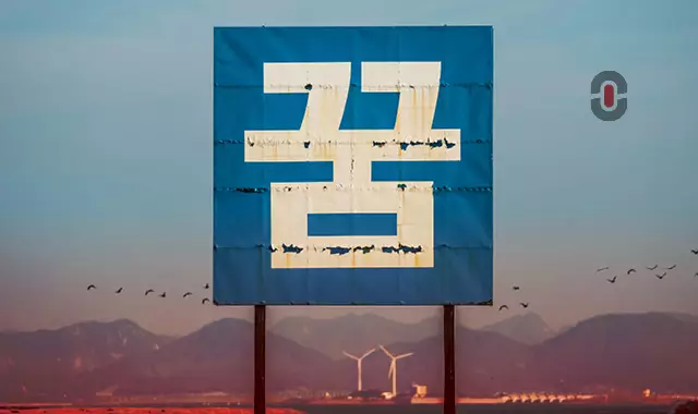
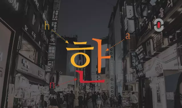
Hangul, the Korean writing system, consists of syllabic blocks that usually require special attention in desktop publishing. Each block can contain up to three letters, which makes spacing and alignment crucial for readability and aesthetics. Hangul is composed of individual characters that form syllabic blocks, each block typically consisting of a combination of consonants and vowels. That means that the DTP software should be able to handle the complex character arrangements and ensure proper alignment and spacing within each block. Hangul’s clock formation demands careful consideration of the vertical and horizontal spacing to maintain visual harmony and readability, unlike the linear arrangement of Latin scripts. Also, Hangul can be written horizontally from left to right or vertically from top to bottom, with vertical writing being particularly common in traditional scripts. The dual orientation makes it necessary that DTP tools support both writing directions.
Effective DTP in Korean therefore, should accommodate these linguistic nuances to ensure that the final output is not only visually appealing but also functionally accurate, meeting the high standards of Korean audiences.
Choosing the Right Software
Doing DTP in Korean requires selecting the most suitable software that will support Hangul effectively. Some of the most popular options for DTP software for Korean language are Adobe InDesign or Hancom Office, offering features tailored for Korean text formatting, such as vertical writing and precise kerning.
Adobe InDesign
This is a layout and page design software for print and digital media, such as flyers, stationery, books, posters, and more. Editors can also supplement pages of text with shapes and images to add more personality to the documents. InDesign also supports advanced features such as multi-page templates, styles, and master pages, allowing for efficient and consistent design workflows. InDesign also facilitates collaboration due to its integration with other Adobe Creative Cloud applications, such as Photoshop and Illustrator.
Hancom Office
Hancom Office is a suite tailored specifically for the Korean market. It has robust support of Hangul and includes word processing, spreadsheets, and presentation software that integrates seamlessly with local linguistic needs. It offers a user-friendly interface and a wide array of features and has become a staple in South Korea as office software.
Practical Tips for DTP in Korean
In the next section, we’re going to look at some specific tips that professionals can utilize when doing DTP in Korean. DTP requires advanced knowledge of the specific software as well as knowledge of graphic design and page layout. But besides that, when doing DTP in Korean, professionals should also know some of the principles and tricks to make a visually appealing, compelling document.
Choose Appropriate Fonts
Selecting the right font is essential not only for aesthetics but also for readability. Here are some of the most popular Korean fonts often used in DTP:
- Nanum Gothic (나눔고딕): A widely used sans-serif font that offers a modern look. It’s ideal for digital content and contemporary designs.
- Nanum Myeongjo (나눔명조): A serif font that provides a contemporary touch, suitable for prints and newspapers.
- Batang (바탕): A classic serif font commonly used in official documents and academic publications. It is known for its readability and formal tone.
- Dotum (돋움체): A sans-serif font preferred for its simplicity and clarity, often used in user interfaces and web design.
- Gungsuhche (궁서체): A brush-type script that imitates hand-written calligraphy, imitation of hand-written calligraphy, used widely in online and print media.
- New Gulim (새굴림): A rounded sans-serif font that is versatile and widely used across various types of publications, from print to digital.
- Malgun Gothic (맑은 고딕): A modern sans-serif font developed by Sandoll Communications, favored for its clear design, suitable for both print and screen.
Finding Korean Fonts:
Professionals can find many Korean fonts for desktop publishing online. Google Fonts offers a wide selection, offering free and commonly used options like Nanum Gothic and Nanum Myeongjo. Another popular option is Naver Fonts, which provides an extensive library of Korean fonts, both free and paid, suitable for various design needs. For professional and high-quality fonts, Adobe Fonts has a wide selection of Korean fonts integrated with Creative Cloud applications. Hancom Office also comes with a bundle of Korean fonts.
All these resources will help you find the most suitable font for your project.
Manage Syllable Block Spacing
- With DTP in Korean, you need to pay careful attention to the spacing between Hangul syllable blocks. Proper kerning and leading are crucial to maintaining readability and a clean layout. You should also make sure that the syllable blocks are not split across lines. Syllables should remain intact to maintain readability and most importantly, maintain proper meaning. In Korean a single syllable can have several different meanings, so professionals need to be careful when adjusting texts.
Vertical Text Support
- In some cases, especially in documents that aim to look more traditional and formal, Koreans write vertically. Utilizing a DTP tool that supports vertical text layout will make your job easier.
Line Breaking Rules:
Line-breaking rules in Korean are crucial for maintaining readability and aesthetic appeal in text layout. Following the specific line-breaking rules for Korean text will help avoid splits that disrupt the reading flow.
- Hangul-optimized hyphenation settings need to be used in order to respect the integrity of texts.
- For line breaks, a word should be split at the end only rather than within. This way it is possible to maintain readability and flow of text.
- Single-syllable words should not appear at the beginning of a new line or at its end, but they must be joined with the previous or following block for clarity and unity.
- Commas, periods, or other punctuation marks should be placed on the same line as the rest of the sentence; they should never be at the start of a new line.
- Hyphenation is rarely used in Korean so it’s better if you avoid it. The best approach is breaking whole words instead of using hyphens.
- The same rules that apply for block integrity and punctuation placement due to syllables are maintained in vertical writing.
Be Mindful of Text Length Change
Translation from English to Korean can significantly decrease text length. It’s best to anticipate a decrease in text length when translating to Korean and inform your clients about the potential need for layout adjustments. The design and layouts should accommodate shorter translations. Make sure to also adjust the typography settings to match the target language’s requirements to ensure readability and visual harmony. Sometimes you may also need to recreate the design from scratch if the original layout cannot accommodate the translated text.
Be mindful when translating:
- Korean street addresses are formatted in the reverse order compared to the UK/US style. The city along with the postal code is typed first on the upper part and finally, the recipient’s name follows it up at the bottom line. Therefore, when writing an address on a document, it is important to discuss this formatting issue with your client before finalizing your work.
- Instead of using millions as a basic unit for large numbers like in English, Korean uses “ten thousand”. For instance, ten million in Korea would be one thousand ten-thousand.
- Since the time of the Korean War, there have been divergences between North and South Korea. A notable example occurs in written texts where there are variations in the usage of English-style and French-style guillemets.