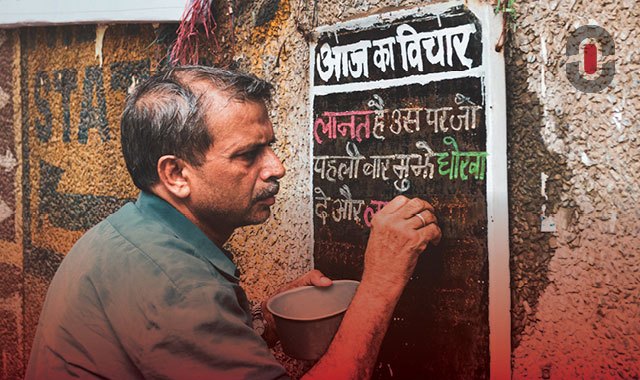
Today we’ll dive into the beautiful world of Hindi. Written in the elaborate Devanagari script—it is truly pleasing to the eye. Just look at it: हिन्दी. The Devanagari script, also called Nagari, falls under the umbrella of the abugida writing systems. Abugidas are segmental writing systems consisting of units. Each unit has a consonant letter and a secondary vowel notation. Unlike alphabets where consonants and vowels have equal status.
In this article, we’ll try to present the topic in a simple manner and we hope this would help everyone out there making their first steps in the vast field of Hindi typography.
The different kinds of Hindi fonts
In the western hemisphere, we are used to basically three kinds of fonts—serif, sans serif, and decorative ones. When it comes to Hindi, it is not so different but the eye needs to get acquainted with the shapes and forms of the Devanagari script.
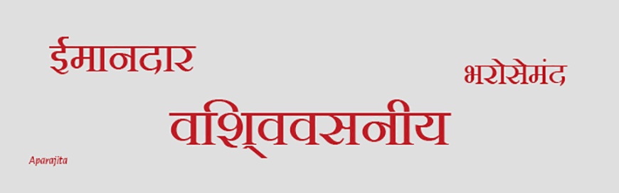
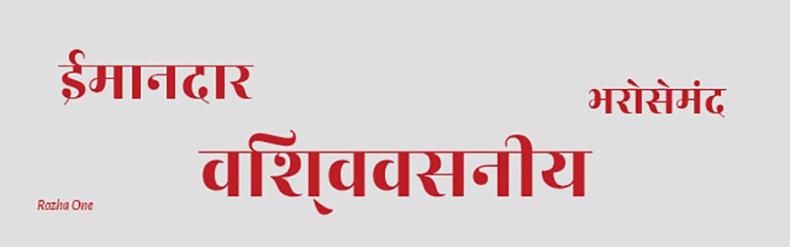
1. The classics. Fonts with contrasting stroke thickness (see the example below) have a more traditional feel to them. This is because these contrasting strokes imitate the strokes made by hand with the pen held at a certain angle. Keep in mind that fonts, where this contrast is really high, would be an excellent choice for headings, posters, and the likes. But they would produce poor readability if used in body text. Fonts with a moderate contrast will provide smooth readability at any size.
Examples:
Lower contrast: Sumana, Amma Hindi, Kohinoor Devanagari, Aparajita
Higher contrast: Rozha One, Yatra One
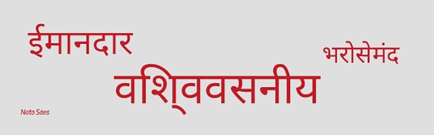
2. The modern. Fonts with uniform stroke thickness (see the example below) generally have a more modern look. They are basically what the Latin grotesque fonts are. Among them, there are some very geometric and some futuristic ones.

Examples:
Mangal, Utsaah, Biryani, Kokila, Nirmala, Chandra, Devanagari Noto Sans*
*In our article about Chinese fonts, we already mentioned the Noto Sans family but we simply love the goal of this project—a single font covering all the languages!
3. The decorative. Very much like their Latin counterparts, the decorative Hindi fonts are often very elaborate, sometimes imitating handwritten brush strokes, sometimes highly stylized or with an abundance of ornaments. Needless to say, they are a no-go for body text. But they can create some spectacular headings.

Examples:
Tillana, Modak, Brahmos Devanagari, Aarti
Let’s talk DTP
Typesetting text in Hindi has its own set of difficulties. It could be especially difficult if you don’t personally know the language. But do not fret, we’re here to help! Here are some basic guidelines which hopefully will help you on your journey in working with Hindi.
- Metric tracking. You’ve probably noticed that line going horizontally across the Hindi text. It should always be continuous—no gaps. In order to ensure that, you need to set the tracking to metric. If you’re using InDesign it’s most probably set to metric by default but it’s good to keep that in mind anyways.
- There is no such thing as capital letters in Hindi.
- World-ready paragraph composer. Use it, it’s a must! If you’re not sure how to do that, there are two ways to set that option (I’m assuming you are using InDesign as it’s the most popular tool). The first is through the Paragraph panel—click on the little “four horizontal lines” icon in the upper right corner of the panel. In the second section of the drop-down menu, you will see four options: Adobe World-Ready Single-line Composer, Adobe World-Ready Paragraph Composer, Adobe Paragraph Composer, and Adobe Single-line Composer. Choose the first or the second option according to your needs. That will apply to the whole paragraph where your cursor is located no matter if it’s selected manually (highlighted) or not. If you have multi-paragraph text— select all the paragraphs you want to apply the setting to. The second way is through the little “three horizontal lines” icon in the upper right corner of InDesign’s window. Your cursor needs to be in the text as this menu is contextual. Same rules for application as in the previous method.
- Punctuation. Unlike the full stop used in English, a vertical bar (|) is used in Hindi. Commas, semicolons, question marks, and exclamation marks are used the same way as in English.
- Italics, underline, and overline are sometimes used in Hindi text but from a typographical standpoint, it’s certainly a bad practice so try to avoid them. Instead, use different font weights to achieve emphasis.
- Legacy Devanagari fonts. They can create a lot of problems so it’s best to substitute them with Unicode fonts. Thankfully, there are already a lot of Devanagari Google fonts available and generally, this issue will occur less and less in the future.
Conclusion
With this summary, we’re trying to be helpful to as many professionals as we can. Be it graphic designers, DTP professionals, project managers, or simply Hindi typography enthusiasts. So we prepared a list of handy links to make your life easier and to spare you some time you could spend reading our amazing blog instead 😉 Joke aside,
- Here you can find 50 Hindi fonts (all of them Unicode) all ready for download.
- And here is the go-to place for your Hindi web font needs.